MOBILE APP DESIGN
ONTECH PRO
MOBILE APP DESIGN
ONTECH PRO
MOBILE APP DESIGN
ONTECH PRO
THE BLUEPRINT
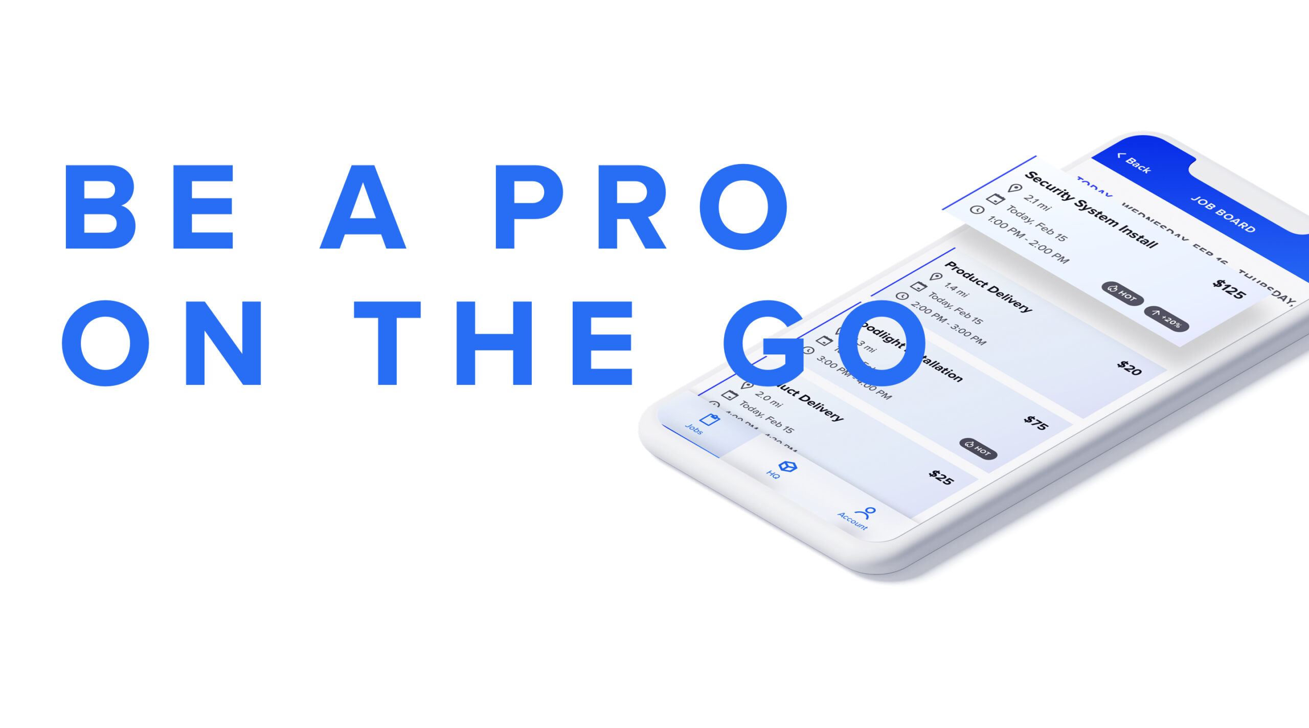
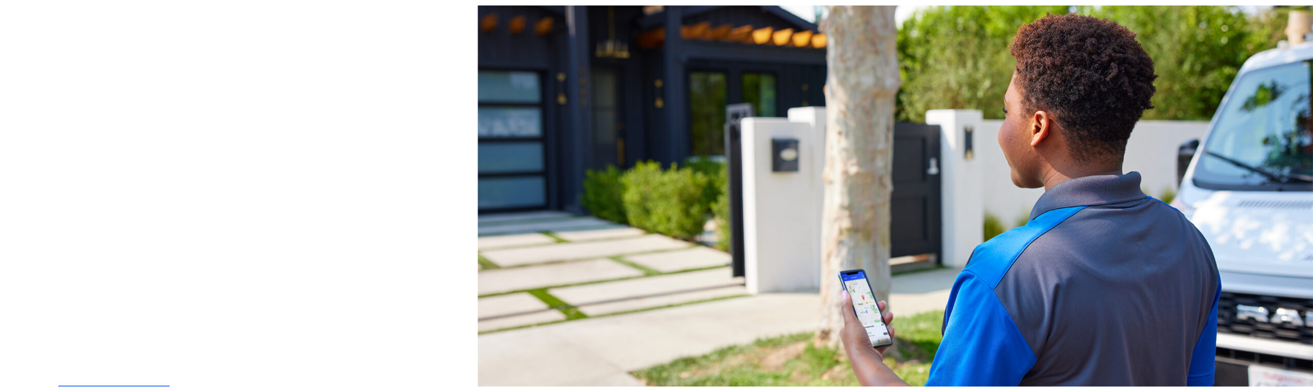
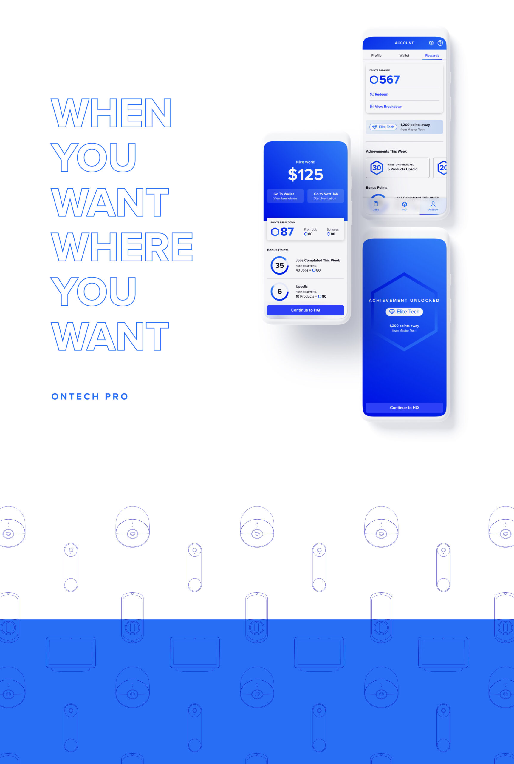
OnTech Pro is a gig-economy app focused on opening a lane for electricians, Smart Home technicians, and delivery drivers to work on their own terms. With OnTech Pro, experts can control their own schedule, work where they want, and get paid instantly.
THE BLUEPRINT
OnTech Pro is a gig-economy app focused on opening a lane for electricians, Smart Home technicians, and delivery drivers to work on their own terms. With OnTech Pro, experts can control their own schedule, work where they want, and get paid instantly.
THE BLUEPRINT
OnTech Pro is a gig-economy app focused on opening a lane for electricians, Smart Home technicians, and delivery drivers to work on their own terms. With OnTech Pro, experts can control their own schedule, work where they want, and get paid instantly.
THE BLUEPRINT
OnTech Pro is a gig-economy app focused on opening a lane for electricians, Smart Home technicians, and delivery drivers to work on their own terms. With OnTech Pro, experts can control their own schedule, work where they want, and get paid instantly.
ACCOUNT MANAGER
Kramer Newsom
ACCOUNT MANAGER
Kramer Newsom
ACCOUNT MANAGER
Kramer Newsom
DESIGN TEAM MANAGER
Rachel Hankins
DESIGN TEAM MANAGER
Rachel Hankins
PRODUCT OWNER
John Lindmark
PRODUCT DESIGNERS
Jessica Pike
James Van Camp
PRODUCT DESIGNERS
Jessica Pike
James Van Camp
PRODUCT DESIGNERS
Jessica Pike
James Van Camp
PROJECT MANAGER
Jessica McKenzie
PROJECT MANAGER
Jessica McKenzie
PROJECT MANAGER
Jessica McKenzie
PROGRAM MANAGER
James McCabe
PROGRAM MANAGER
James McCabe
COPYWRITER
Ryan Flannigan
UX RESEARCHERS
Kim Mosberger
Sarah Pitts
UX RESEARCHERS
Kim Mosberger
Sarah Pitts
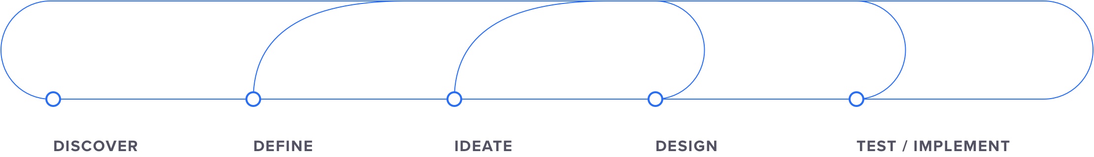
The Process
The Process
The Process
The Process
Our team worked within an agile scrum structure over 2-week sprints. Research and design worked continuously together with a collective responsibility. The process started with a general idea of what needed to be designed based on stakeholder input and as research was conducted, the team established and prioritized a backlog of features to explore and design.
Our team worked within an agile scrum structure over 2-week sprints. Research and design worked continuously together with a collective responsibility. The process started with a general idea of what needed to be designed based on stakeholder input and as research was conducted, the team established and prioritized a backlog of features to explore and design.
Our team worked within an agile scrum structure over 2-week sprints. Research and design worked continuously together with a collective responsibility. The process started with a general idea of what needed to be designed based on stakeholder input and as research was conducted, the team established and prioritized a backlog of features to explore and design.
UX RESEARCH
UX RESEARCH
UX RESEARCH
UX RESEARCH
UX RESEARCH
Stakeholder Interviews
As the product road map and backlog became more defined, we conducted numerous stakeholder interviews within the company to obtain project-relevant information and suggestions. These stakeholders had knowledge, wisdom and insight that helped our team make important product decisions.
The Process
The Process
Competitive Analysis
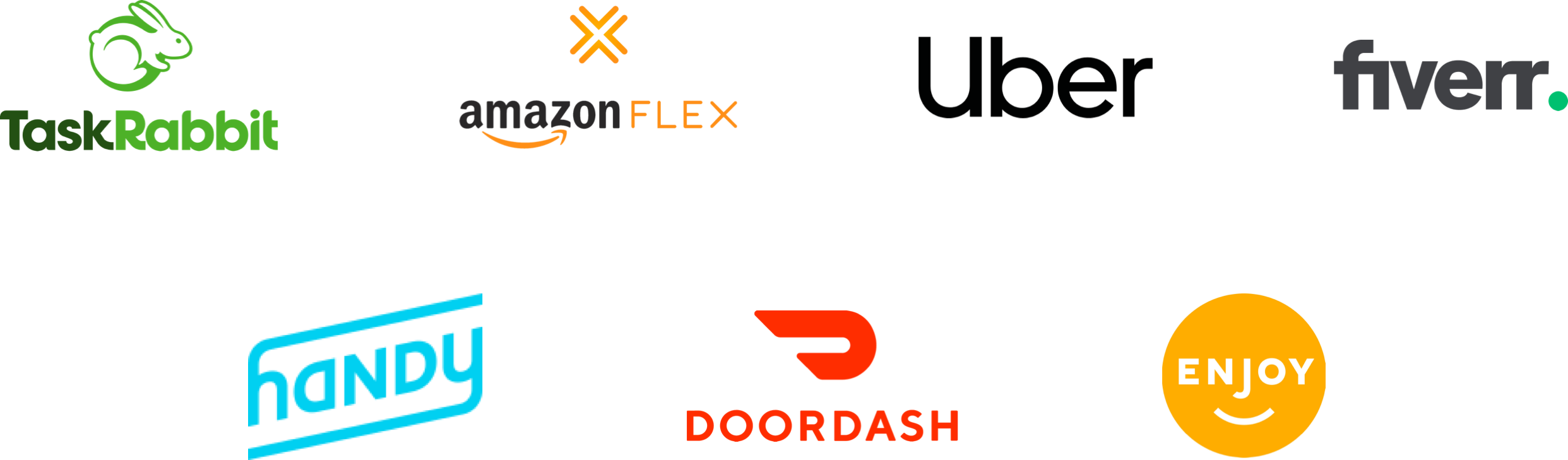
Another key research component in the early stages was a detailed competitive analysis. We reviewed seven indirect and direct competitors to assess their strengths and weaknesses and identify strategic opportunities.
The Process
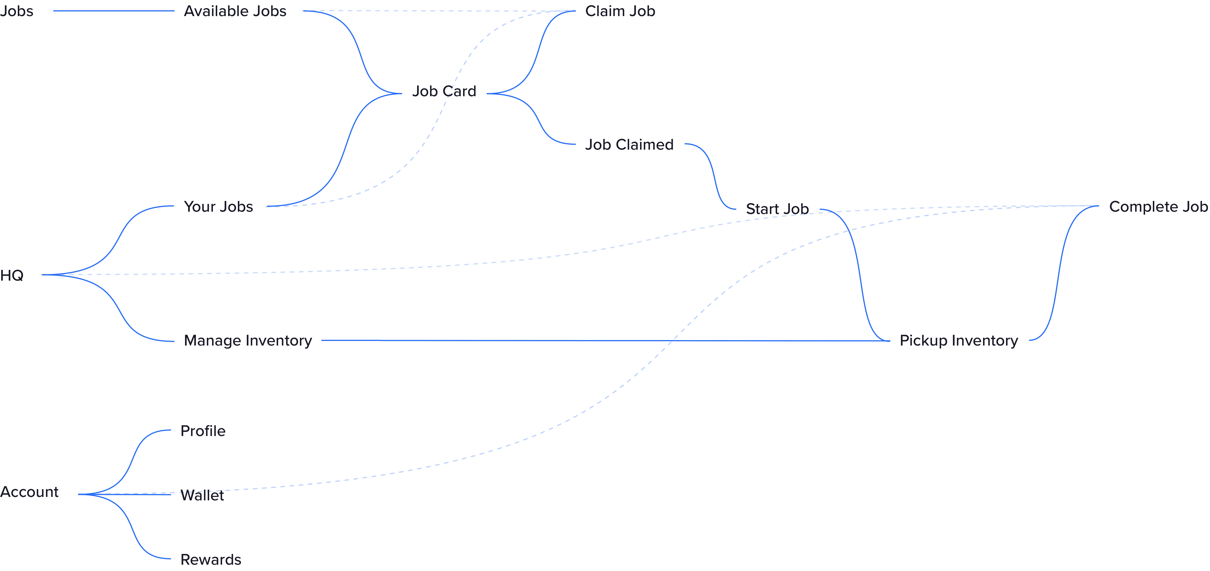
User Flows
This process began by examining current product flows and working through and identifying optimized paths. We segmented and defined our ideal experience and then created wireframes and prototypes to validate. Flows are a great method for segmenting and defining your user experience. They allow you to track what screens users typically see when they interact with a product and how they interact with those screens.
The Process
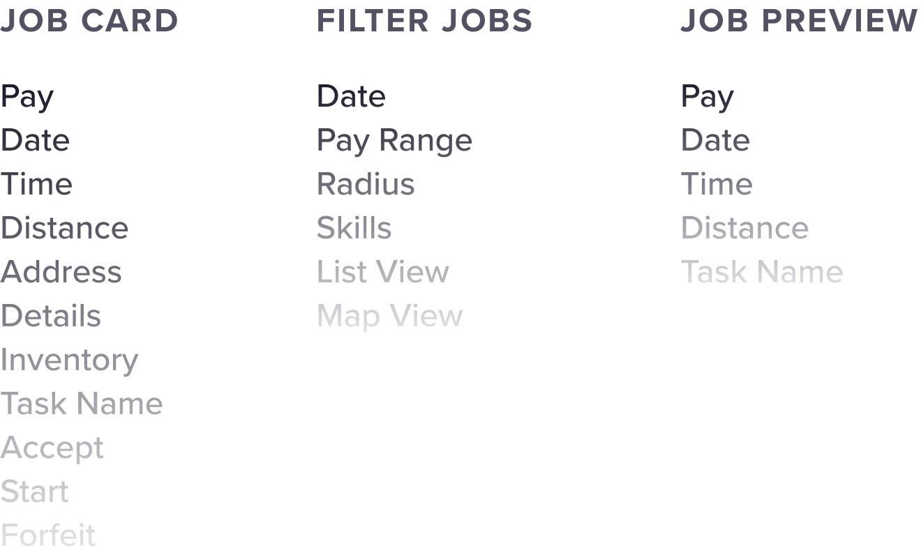
Information Architecture
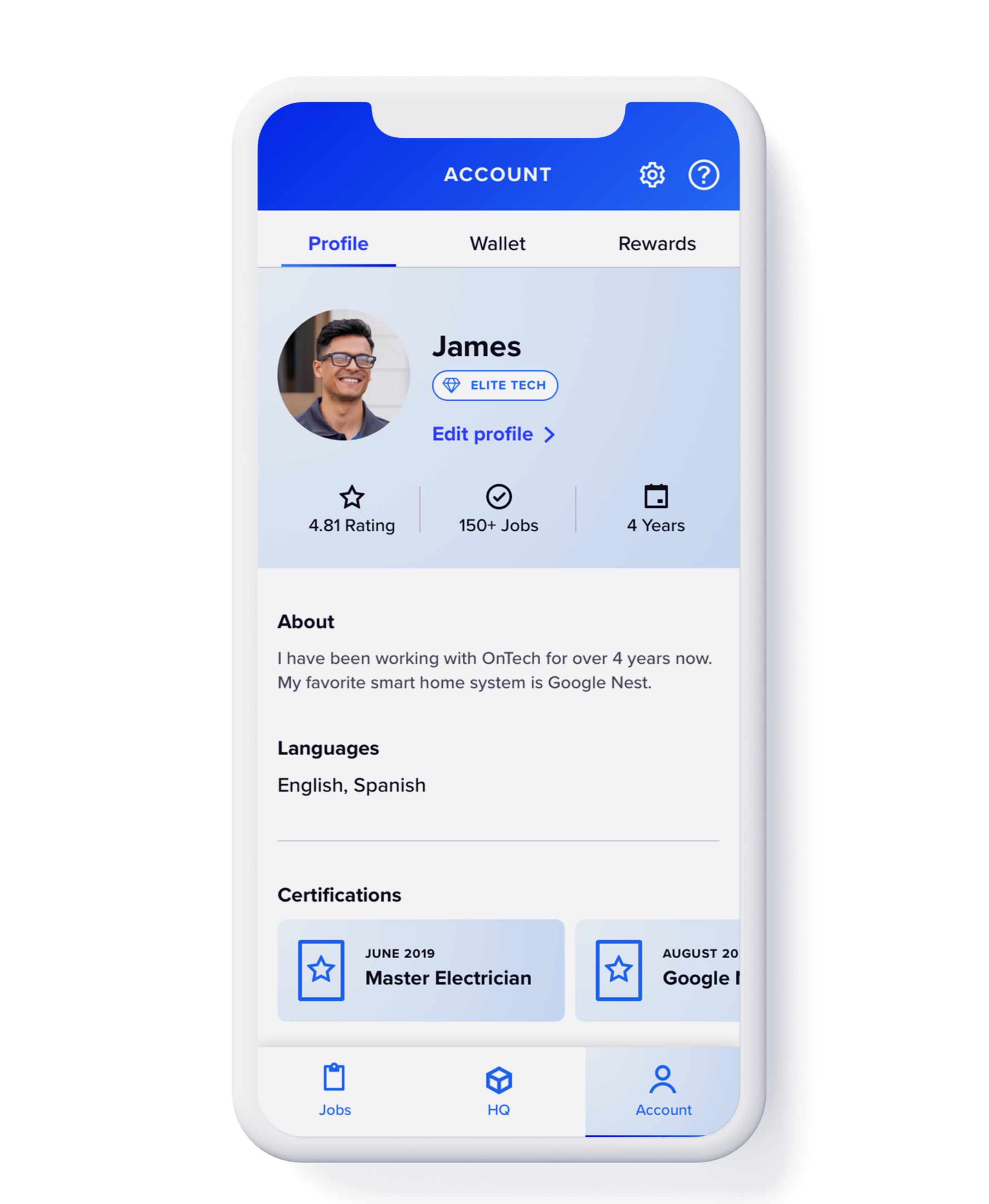
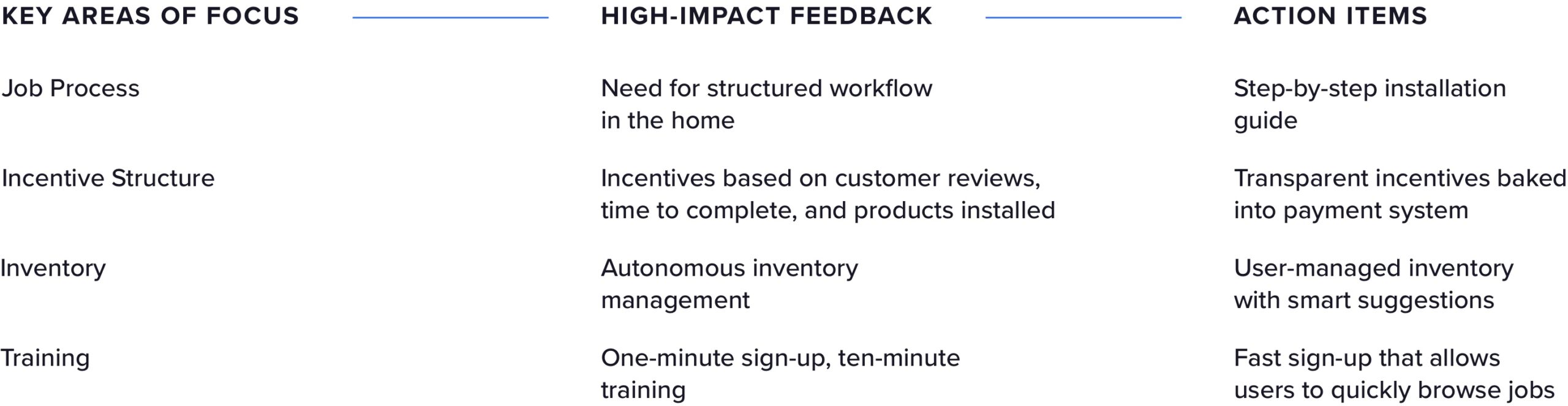
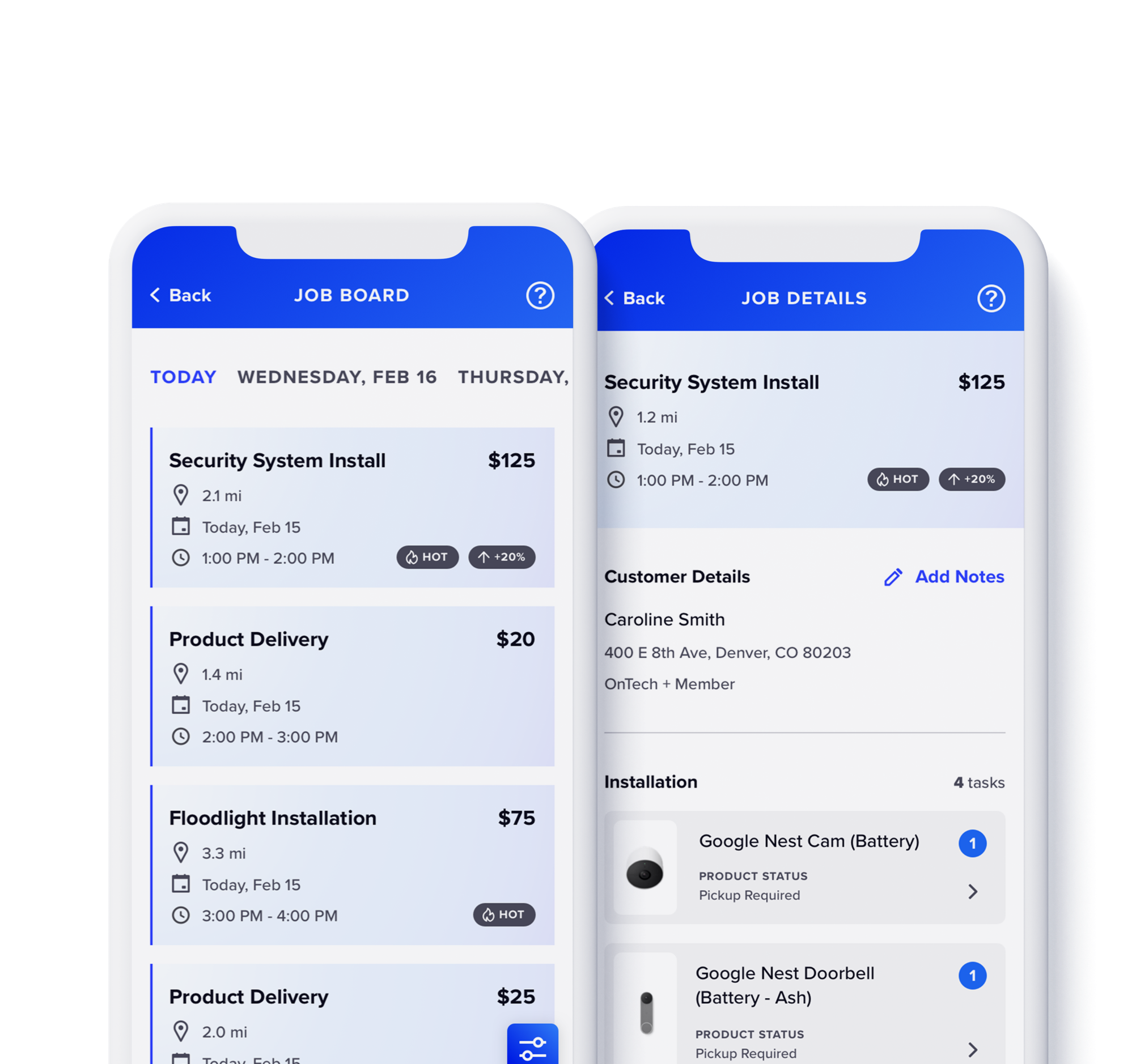
Metadata structure and sorting was a large part of building logical and easy-to-digest information for users. Job details like time, location and payment would be pulled from data sets and inserted on a single card containing all job information. We used surveys, card sorting, usability and A/B tests to bring a sensible hierarchy to vital information through the eyes of the user.
The Process
Surveys
In our initial exploration process, we were interested in examining the background, priorities and motivations of gig workers within the United States. We surveyed 200 gig workers with a 15-question survey consisting of multiple choice questions, satisfaction rating, true/false and open-ended questions.
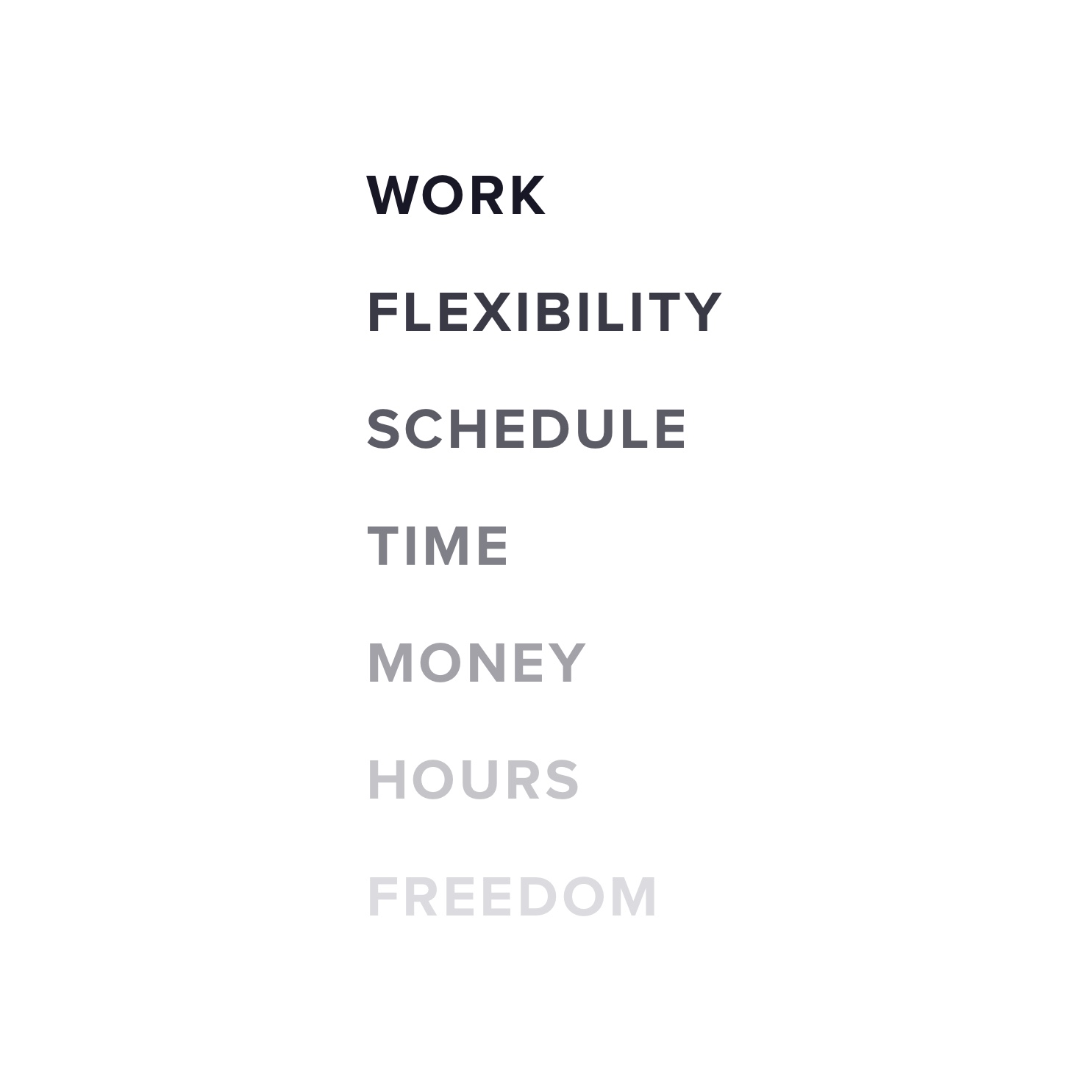
Card Sorting
We wanted to identify information that gig workers prioritized when reviewing potential jobs. We researched demographic information for gig workers within the United States for the last five years. We then created a lookalike audience to test with. Annual income, age, gender, employment status, industry and job title were variables we used to control and build our lookalike audience. We conducted a card sorting test with 15 participants. We compared our results with our stakeholders and legal requirements to design a job card that best met the needs of all parties with an emphasis on gig workers.
The Process
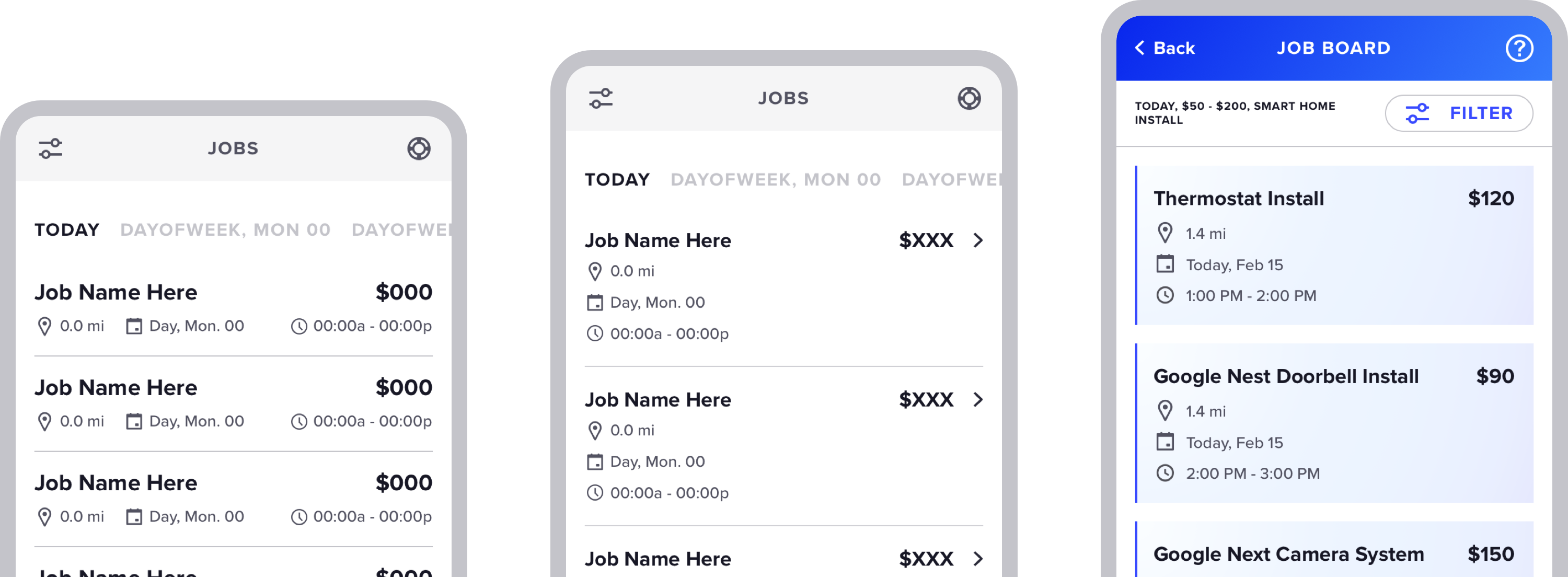
A/B Testing
Iterating on layouts involved designing multiple layouts and testing them for effectiveness. Our team ran multiple A/B tests to determine the best way to display information through the eyes of the user.
The Process
A/B Testing
Iterating on layouts involved designing multiple layouts and testing them for effectiveness. Our team ran multiple A/B tests to determine the best way to display information through the eyes of the user.
Usability Testing
Our team implemented regular usability testing to quickly iterate on wireframes. The consistent feedback allowed us to make rapid changes that were validated by actual users. This would give our layouts a solid foundation of patterns to build upon for new features.
The Process
Get in touch
Denver, CO
jesspikecreative@gmail.com
217-413-9904
© Jessica Pike 2022 - Designer